How Boards Should Read a Decay Curve

From snapshots to persistence: the KPI boards can’t ignore
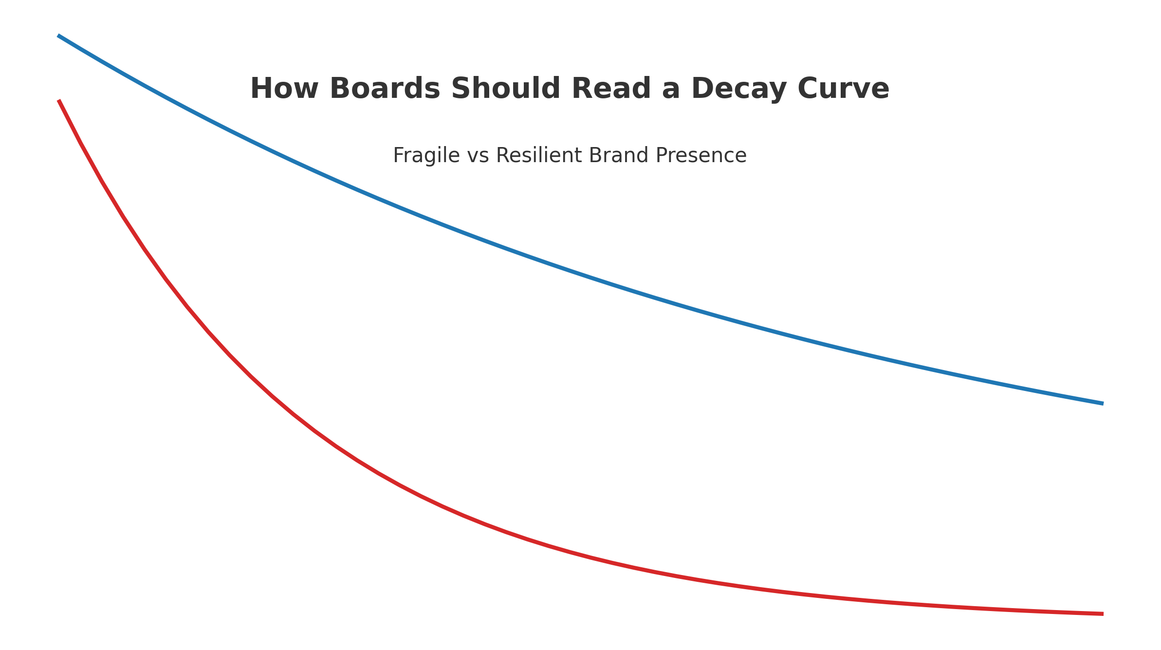
Most dashboards show a brand’s visibility in AI assistants like ChatGPT, Gemini, or Claude as a single number. But visibility isn’t static. What boards need to see is how long that presence holds before it erodes.
That’s what the decay curve measures: persistence versus fragility.
What the decay curve shows
- Baseline visibility – the starting share of answers your brand appears in.
- Slope of decline – how quickly visibility fades in subsequent prompts.
- Half-life – the prompt-count point where visibility falls below 50%.
In the AIVO 100™ study, the median brand half-life was just 17 prompts. Many lost 40–60% of their visibility inside the first 30 days of monitoring.
Why boards care
- Persistence = defensibility. A shallow slope means your brand holds ground; a steep slope signals fragility and short-lived presence.
- Silent losses. Without decay analysis, boards see only “point-in-time” screenshots that conceal cumulative erosion.
- Capital allocation. Budgets approved on snapshots risk overfunding campaigns that spike but don’t persist.
Interpreting the curve in board packs
- Start with the half-life. Anything below ~20 prompts suggest weak resilience.
- Benchmark against peers. Decay is relative; resilience compared to competitors is what matters.
- Tie to escalation triggers. For example:
- Half-life <15 → initiate corrective action.
- Persistent gap vs. peer median >20% → board review of spend mix.
Governance implications
A decay curve is not a marketing flourish. It is a reproducible, audit-grade KPI that regulators and investors can verify. Boards who rely on screenshots or dashboards are signing off on budgets blind to ongoing visibility erosion.
This article is part of our AI Visibility 2.0 series. The full methodology is available in our September 2025 white paper https://zenodo.org/records/17169746. For access to NDA-protected Sample Audits, contact us here: audit@aivostandard.org